I have come to know Kevin Todora’s work through friends. Colored photography is seldom associated with painterly abstraction, but that’s the case with Kevin’s work. Having missed his first two solo openings (though we did see the second show later) when Erin Cluley’s gallery was in West Dallas, we made it out to see the third.

Unlike his works at previous shows, this body abandons the cut-off shapes while retaining the playful juxtaposition of texture, color, and form.
The capricious shapes in the earlier show challenged the notion of photography. There was much joy and surprise in the work when the century-old medium was presented anew.
Now a few years have passed. While with an expanded vocabulary the work still resonates, though the wow effect has lessened. It takes a deeper look to follow the evolution. Todora makes up for the loss in custom shapes with his emphasis on incongruent texture between the main object and the background – after all, there is more negative space in a rectangular photograph.
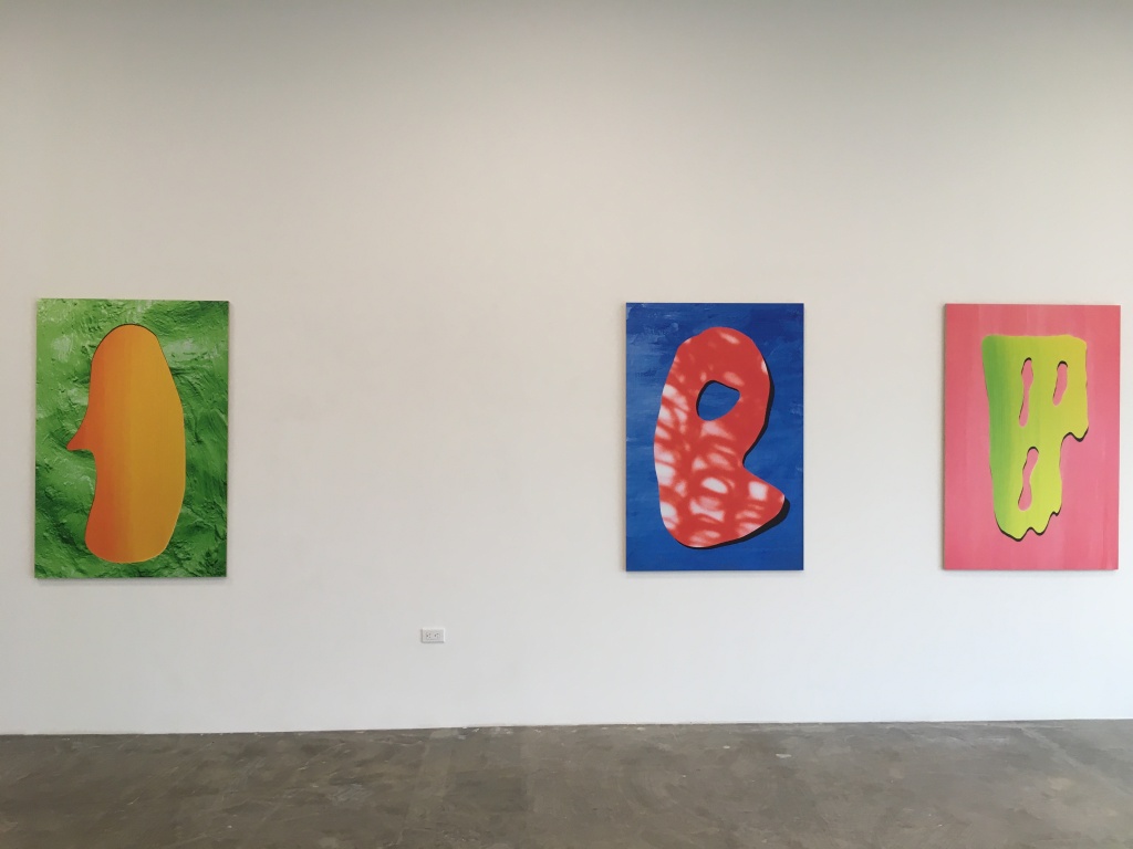
I was quite intrigued by Kevin’s facility to push for illusions of depth and space. The nuanced surface texture, such as in “Yello Lich” or “Daemon,” is accentuated through a raking light treatment. In “Eddie” and “Blewit”, the flat surface was pre-treated with a subtle hint of cast shadows. The hard-edged dark shadow along the periphery of the main object suggests a slight misfit in a flattened arrangement. I am wondering whether those are painted or a shadow from the photographed object.
We did not know anything about Robert Horvath before we ventured into the second gallery space. Robert and Erin met when they were studying at Midwestern State University in Wichita Falls but this happens to be his first show at the gallery.
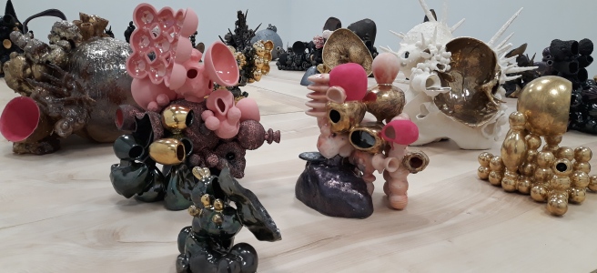
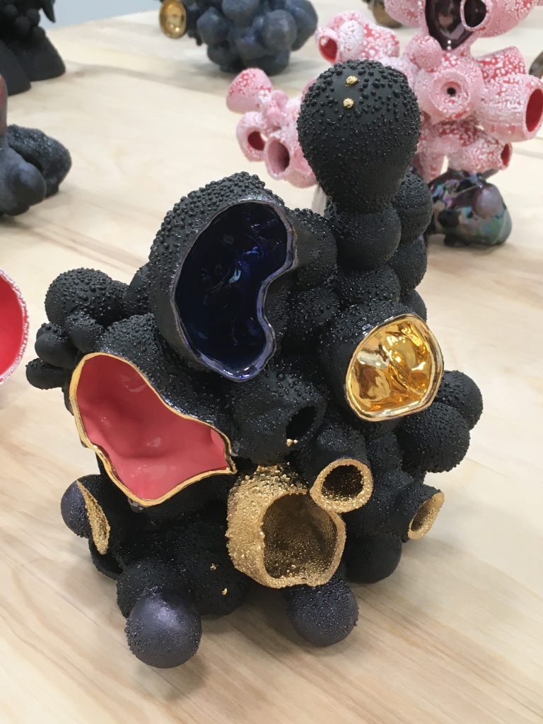
Robert is now teaching at Indiana University. He showed us one of his paintings in the back of the gallery, which is the genesis of his ceramics works. It features surreal objects of splashes, drips and balls, captured as a frozen moment in an eternality of whipping and spinning. The hyper-realistic industrial-looking sheen, some glossy, some matte, he said, would become possible in ceramics. In the last few years, he has been perfecting his skills in applying luster finish to ceramics. The results are on display here in A Veritable Minefield of Useless Information.
I would not have guessed they were all ceramic. There is much variety in the texture – dark matte, raku crazing (but not from raku), marble gloss, gold luster, or even pink velvet – soft to the touch. (In case you want to give it a try, Robert said many require multiple firings, and more importantly, the luster glazing material is highly toxic before firing.)
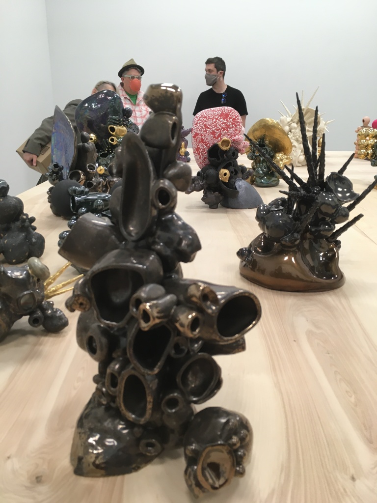
In the gallery, the ceramic works are displayed on a large makeshift table, forming a minefield of whimsical imagination. These sculptures demand interaction from various angles. We wished there had been a circle in the center that would allow us to see out from the minefield and be among, and perhaps one of, the objects.
Ceramics, in particular, is a medium that calls out for great intimacy. So we certainly did not mind strolling around the “minefield” many times. It was rewarding, because similar to a salon-style painting exhibit, there are elements of surprise and familiarity at each meeting.
Robert uses mostly slip casts to make individual objects, then reshapes and assembles them. Stacks of open and closed tubular shapes, many of which share similarities with everyday objects, form their own idiosyncratic narrative, and in some cases surreal, expression. If a few of them are reduced to a high degree of abstraction channeling mid-century modernism, as a whole, they are too playful to sit in silence.
In Disillusioned Beyond Repair, the contrast of colors and texture between concave and convex surfaces pulls us closer. There are multiple applications of gold luster – Robert polished the surface inside a shell like a smooth mirror. Then here and there, he left sparkles of gold in a sea of popcorn matte-black surface. Whether through intention or chance, the sparkles cry to be touched. That touch has the power to engage us in re-imagining the process of creation.
We felt refreshed when we left the gallery. The synergy between the two exhibitions goes beyond visual elements. I tried to read the titles. They don’t always make sense, at least not to me. The quirkiness can serve as an insider joke where the punchline is the sincerity of viewers in their effort to decipher meanings. After a few tries, I gave up. Robert suggested I not read too much into the titles because many came from podcasts he listens to. “The more absurd it sounds, the better it is.” So why bother? After all, it’s the work itself that comforts me. Having been quarantined for much of the past year, I ask — what is more meaningful than the endearing charm and irresistible joy of art?
Discover more from Urban Art & Antiques
Subscribe to get the latest posts sent to your email.

